Church Graphics 2.0: Stop Filling Out the Form
The biggest update we have shipped: chat instead of a form, a new image model, sizes after the pick, an editor on the project page, Magic Layers, and a style recipe.
Every church graphics tool starts you the same way: a blank page, or a form. Pick a type. Pick a size. Pick a style. Type a title. Type a subtitle. Upload a logo. Choose a mood. Then you get to see something.
That is the part we deleted. In Church Graphics 2.0, you type one sentence about what Sunday needs and the app asks you the rest — one question at a time, like a designer would. Underneath that: a new image model drawing every graphic, an editor that lives on your project instead of in a separate screen, and a one-minute way to find your church's look — one graphic at a time, thumbs up or thumbs down.
Here is everything that changed, with the actual screens.
1. Chat with it instead of filling out a form
The new front door is one box.
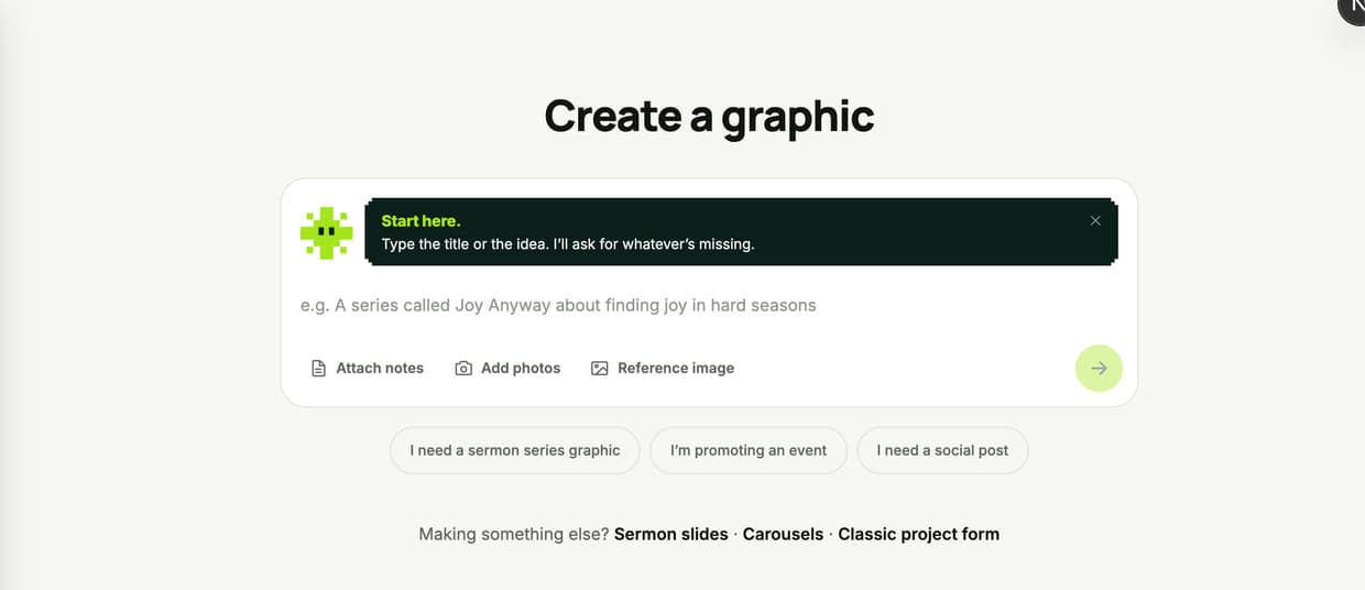
Type "a series called Joy Anyway on Philippians 4" and hit enter. That is the whole start. From there it asks the things a designer would ask — is there anything else that has to be on the graphic, do you want the scripture reference on it, are there colors or images you want in or out — one at a time, with tappable answers underneath so most of the time you never type again.
When it has enough, it shows you three looks chosen for your title, not a generic grid. Pick one and you land on a plain-English summary of exactly what is about to be made: the words that will appear, the scripture, the written design direction. Nothing gets rendered until you have read that screen.
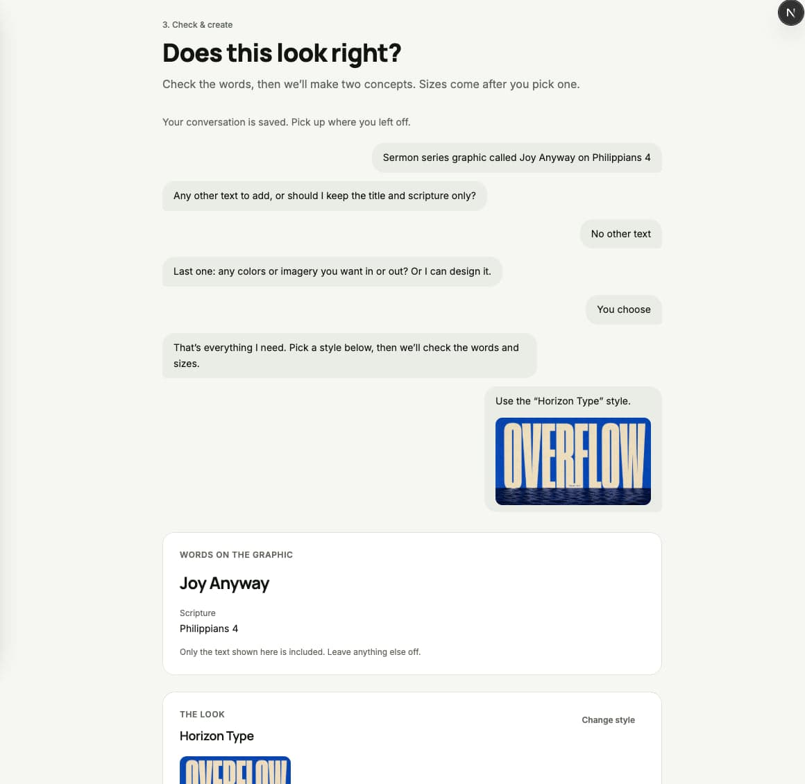
If something is wrong, you do not go back through a wizard. You say so in the chat — "actually call it Joy Regardless" — and the summary updates.
And if you liked the old form: it is still there, unchanged, linked right under the chat box as "Classic project form." Nobody lost a workflow in this update.
2. A new AI model draws every graphic
Every generation and every edit now runs on a new image model. Faster, sharper, and — the part that actually decides whether a church graphic is usable — it spells.
Type is where AI-generated graphics normally fall apart. A letter goes missing. A word turns into letter-shaped mush. You end up rebuilding the title by hand, which defeats the whole point. The new model sets real, clean lettering, and then every render gets read back by a second AI before you ever see it. If a word came out wrong, it quietly redraws it once. Casing differences do not count — only actual broken text.
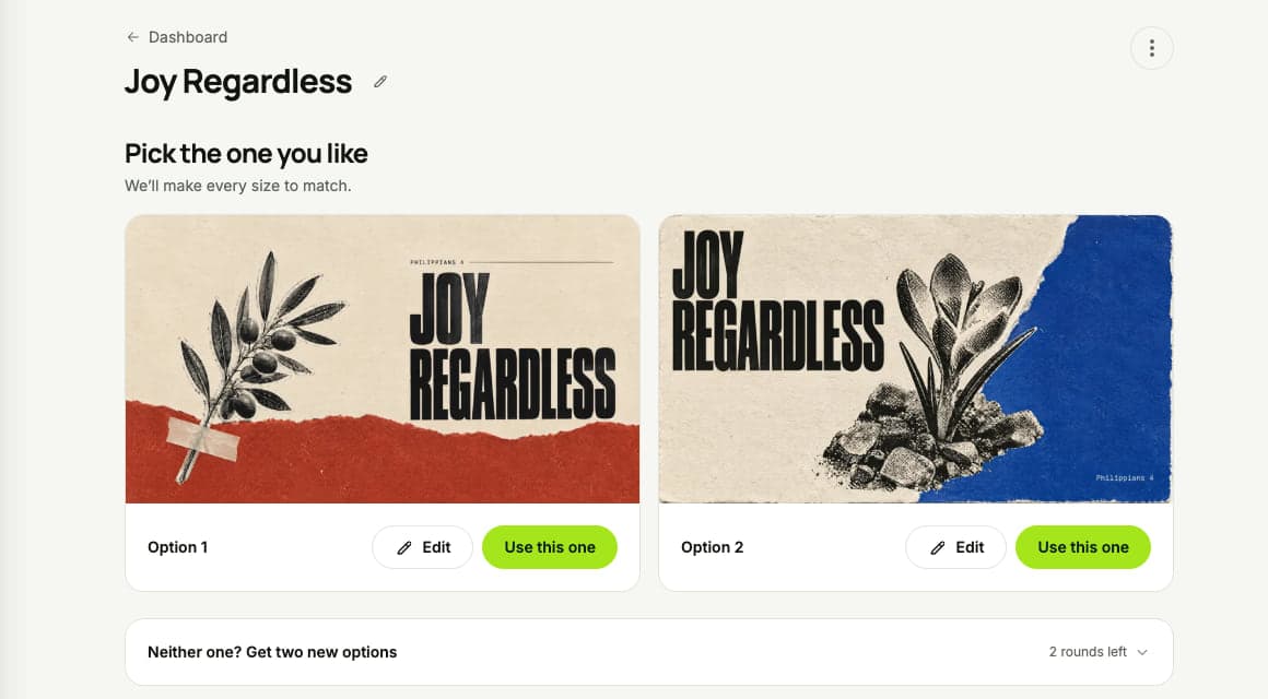
You get two genuinely different concepts in about a minute, at full 2K resolution — no "draft then upscale" step that quietly redraws your design. Pick one. If neither is right, ask for two more.
Alongside the model, eight new styles went into the catalog. They were written by studying about sixty-five church graphics we would actually hang on a wall and naming what they had in common — printed finishes over digital glow, one oversized confident title, one concrete object instead of a busy scene, a third of the canvas left quiet.
3. Pick the design first, then take any size
The old flow made you guess every size you would need before you had seen a single pixel. Now a project renders two 16:9 concepts, you choose the one you love, and the size menu is sitting on the project page waiting.
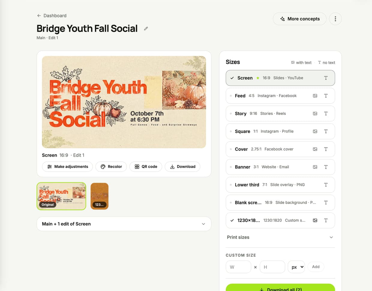
Tap a row and that size gets rendered on demand — laid out for that shape, not cropped to it. A story is not your 16:9 with the sides chopped off; the design gets rebuilt vertically.
- The six you post every week. Screen (16:9), feed (4:5), story (9:16), square (1:1), Facebook cover (2.75:1), wide banner (3:1).
- Lower thirds and blank screens, as PNG. Same artwork with no words on it — ready to sit behind your own text on a slide, or under the lower third on your stream.
- Print. Flyer, half page, 5×7 invite, postcard, bulletin, and an 18×24 poster.
- Any size at all. Type the pixels or the inches. The lobby screen, the banner stand, the odd shape your building has.
Every size can also be rendered text-free, so one design can be both the announcement and the background for next week's.
4. The editor moved onto your project — and it saves itself
There is no separate editing screen to open and lose your place in. Hit Make adjustments on a project and the right side of the page turns into the tools.
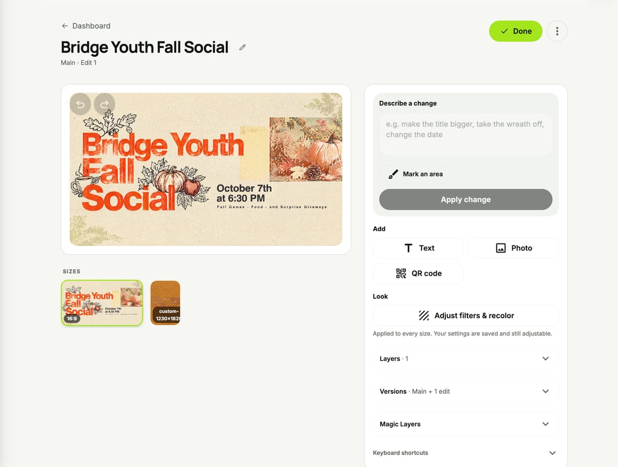
There is also no Save button anymore, because there is nothing to remember to save. The flattened image is written after every edit, when you switch sizes, and when you hit Done.
- Say what to change. "Make the title bigger." "Take the wreath off." "Change the date to the 14th." It redraws that part and leaves the rest alone.
- Or paint over the exact spot. "Mark an area" lets you brush the piece you mean, so nothing else moves.
- Add your own text, a photo, or a QR code. The QR code is real and scannable — point it at your giving page or the sign-up form and it prints.
- Every edit is kept. Versions stack on the side, named after what you asked for. Nothing you liked ever gets overwritten, and you can promote any old version back to Main.
5. Twenty-six finishes, previewed on your actual graphic
Filters and recolor were rebuilt from scratch. The thing that makes it usable is small: every filter tile is your design already wearing that finish. You are not reading a list of names and imagining.
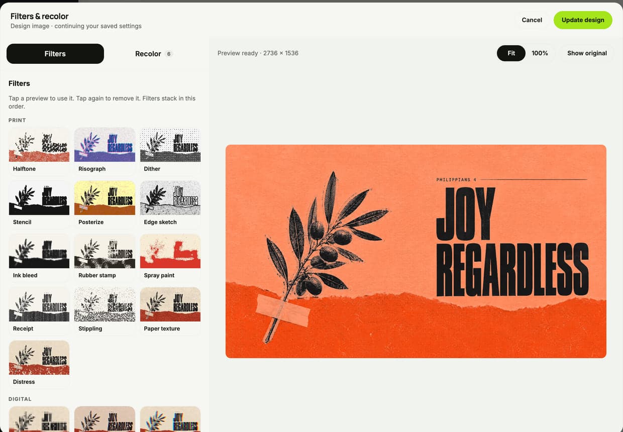
Halftone, risograph, dither, stencil, posterize, edge sketch, ink bleed, rubber stamp, spray paint, receipt, stippling, paper texture, distress, pixelate, VHS, colour split, thermal, pixel sorting, film grain, vintage, black & white, vignette, glow, light leak, golden film, sharpen. Tap one to try it, tap again to take it off, stack two if you want. Every knob is exposed with a slider and a number field — no hidden "intensity" guesswork.
Recolor is in the same window. It reads the colors already in the design and lets you swap any of them, or drop in your church's palette and re-dress the whole thing at once. Colors are matched by lightness, so darks stay dark and lights stay light and the graphic never turns to mud.
Whatever you land on is applied to every size in the project, and the settings ride along with the design — reopen the dialog tomorrow and the sliders are exactly where you left them.
6. Magic Layers: take a finished graphic apart
This is the one people do not expect to be possible.
An AI graphic normally arrives as one flat picture. The olive branch is in the image — you cannot move it, shrink it, or take it out. Magic Layers pulls the picture apart: you get a clean background with the objects removed and painted back in, plus a separate movable piece for every object and every word.

Slide the title left. Shrink the illustration. Delete the date. Or download just the clean background and use it behind your own words on a slide — which is the request we get most. The split lands as a new version, so your original stays exactly as it was, and it takes a minute or two.
What is coming next: turning a split-out word back into real, retypeable text that matches the original lettering. The pieces are movable today; the font matching is the part we are finishing.
7. Find out what your church's look actually is
Most of us cannot describe our style. We just know it when we see it. So the new style recipe does not ask you to describe anything — it deals you real church graphics, one at a time, and you say yes or no.
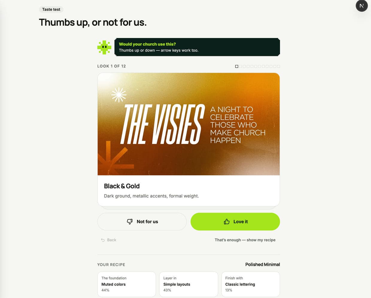
Four cards in, it names your recipe — something like Polished Minimal or Photo-Led High-Impact — and shows the mix underneath: the foundation, what gets layered in, how it gets finished. From then on the styles suggested for your projects lean your way, and there is a "Use my recipe" shortcut right in the chat.
It takes about a minute, and it is a starting point rather than a rule — any single project can still go a completely different direction.
Coming soon: two more that are already built
Both of these appear in the sidebar with a SOON tag. That is deliberate — we would rather show you what is coming than hide it.
Brand Journey builds a real brand for your church, with you: a logo drawn from your church's name, a wordmark, a color palette, fonts, a brand board, and a PDF guide you can hand to a volunteer. Then every graphic you make afterward uses it automatically.
Sermon Studio takes a link to Sunday's sermon, finds the moments worth clipping, cuts them vertical, keeps the speaker in frame, and burns on word-by-word captions. Short clips ready to post without opening a video editor.
Everything else in 2.0
- Drag things straight into the chat. Photos from the event, a PDF of the bulletin, your sermon notes — drop them on the box and they go into the brief.
- It notices when you are making the wrong thing. Paste a full set of sermon notes into the graphic chat and it will point you at Sermon Slides instead.
- Close the tab mid-conversation. Come back and it is exactly where you left it.
- The whole app got redrawn. One rail, a new icon set, real light and dark modes, billing where you would look for it, and a phone layout that is not an afterthought.
- A community feed. See what other churches are making, and share yours if you want to.
- Sermon slides and carousels are still one tab away on every project — now with the new model behind them.
The short version
You say the thing. It asks the smart questions. You pick between two real options, take whatever sizes you need, and fix any word you want without starting over.
That is what 2.0 is. Everything above is live right now in every account — nothing to switch on, nothing extra to pay for.
Try it yourself
Type one sentence about this Sunday and see how far it gets you. 3 days free, everything unlocked.