Don't Start From a Blank Look
Saturday night, blank canvas. Drop a photo you already have, keep the words, pick a look.
Saturday night. The title is finally locked. ProPresenter is open. You are staring at a white rectangle.
That rectangle is the whole problem. Not the sermon. Not your taste. The empty artboard. You start hunting a template, or you start "designing," and forty minutes later you still do not have a look. The words were ready. The picture was already on your phone. You just started in the wrong place.
Do not start from a blank look. Start from something real.
The blank canvas is a stall, not a method
A volunteer creative director does not lose Saturday to "being creative." You lose it to deciding what this Sunday is supposed to look like from nothing.
Canva does not fix that. A folder of last year's PSDs does not fix that. A prompt that says "make a church graphic" does not fix that. All of those still ask you to invent a visual world before you can put "Sunday Gathering" on the screen.
You already have a visual world. It is the sanctuary. It is last week's graphic. It is the photo you took walking into the building at 4:30 when the light was actually good. Use that.
Drop the photo you already have
In Church Graphics, a new project does not begin with a blank page. Step two is Style. You can open a folder of looks — or you can upload your own reference.
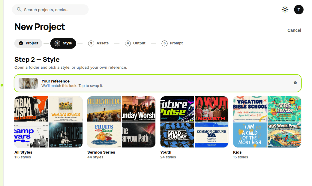
That green bar is the move: Your reference. We'll match this look.
Three photos that work, in order of how often you already have them:
- The sanctuary. Wide shot, pews, windows, the actual room people will sit in on Sunday. This is not "stock church." This is your room.
- Last week's graphic. If the series is the same, drop last Sunday's file and keep going. You are matching a look you already shipped, not starting a new brand at 10pm.
- The photo on your phone. Campus trees. The lobby at dusk. A table from Wednesday night. A hallway. If it is from your building this week, it will feel like your church on a screen.
Do not drop a pumpkin clip-art jpeg and hope. Do not drop a random "autumn leaves" download from a pack you bought in 2024. Drop something a person in your congregation would recognize if they squint.
Keep the words
The title is not the decoration. The title is the job.
Type it the way it will be said from stage. Short. Exact. If the pastor is calling it "Sunday Gathering," do not "improve" it to "A Sacred Assembly." If the series is two words, use two words.
Church Graphics puts the words on the graphic as written. That is the point of the next still: same sanctuary photo, same sentence, already sitting on the art.
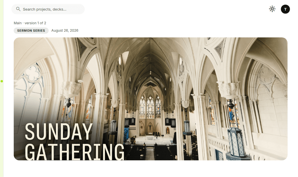
Notice what is not happening here. You are not rebuilding the type in Canva. You are not sliding a text box around a stock image until the contrast accidentally works. The photo is the look. The words stay put. If the type needs a dark edge to read on light stone, that is a finish, not a redesign.
If you have a date, a time, or a verse, put those in now too. Do it once. You will need them on the feed post and the story later. Changing "10:00 AM" in five files at 11pm is how Saturday dies.
Pick a look
Same photo. Same words. Two directions. You pick one.
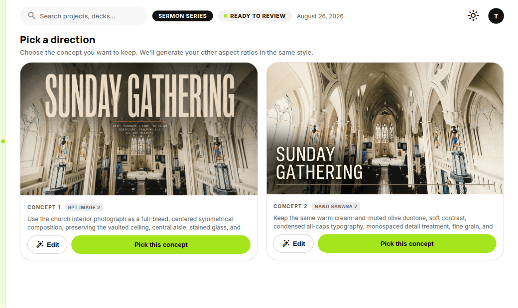
This is the screen that replaces the blank canvas. Pick a direction. One concept keeps the sanctuary as a full-bleed photo — vaulted ceiling, aisle, stained glass, title across the top. The other takes the same room and treats it like a graphic: warm cream and muted olive, condensed type, a little grain.
Neither one asked you to invent a style from a white box. You dropped a photo, kept the words, and chose.
That is the whole Saturday-night workflow:
- Title and the few words that have to be on every file.
- A photo you already have.
- Two looks. Pick one.
- Then get the other sizes in that same look — do not redesign the square from scratch.
If both concepts are wrong, swap the reference. A different phone photo will pull a different look faster than rewriting a paragraph of prompt.
What this is not
This is not "learn to prompt." You do not need four adjectives and a lighting lecture to get a Sunday graphic.
This is not a template hunt. Template libraries are full of rooms that are not yours and autumn packs that already ran at the church down the road.
This is not a 10-minute lecture on generating a four-week series from a cinematic sunrise brief. If you want that workflow, we already wrote the ten-minute series piece. This post is the other door: you have a picture, you have a title, you need a look tonight.
Do this tonight, in this order
Open Church Graphics.
Paste the Sunday title first. Then drop the sanctuary photo, last week's graphic, or the photo on your phone as the reference. Keep the words. Pick the concept that reads from the back row and in a phone thumbnail.
If the title is hard to read, that is the only problem to fix. Do not throw the look away because one word sat on a window. Edit the type. Keep the room.
Then stop. Do not open a second tool to "make it more designed." Ship the one you picked.
A blank canvas makes you feel like you have not started. A photo means you already have. Drop it, keep the words, pick a look.