Fix One Thing. Keep the Look.
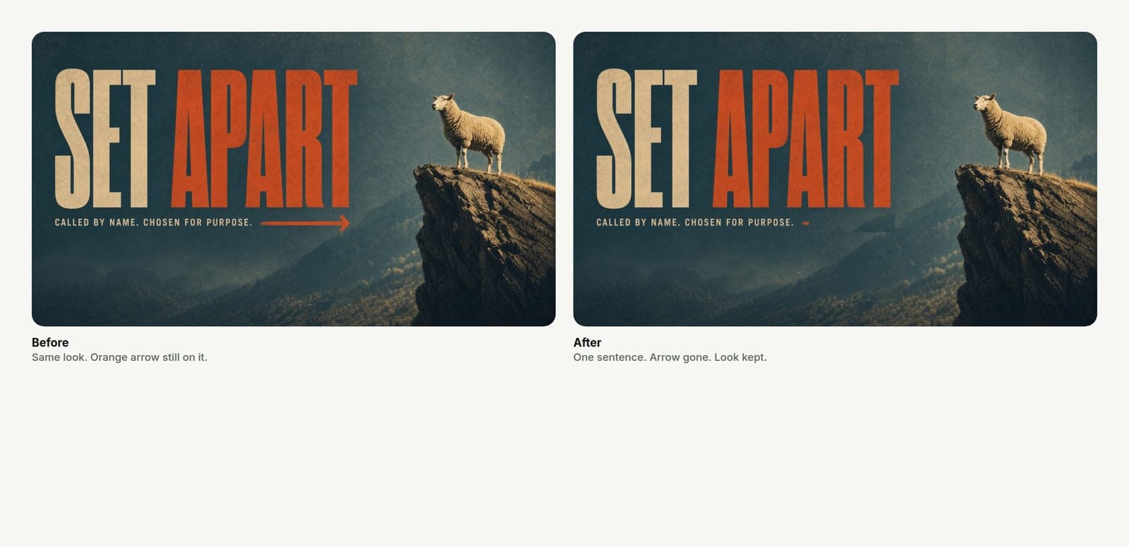
The pastor texts: take the orange arrow off. Do not start over. Edit the one wrong detail in the project you already approved.
You finally like the look.
Then the pastor texts: take the orange arrow off. Or the date is wrong. Or the subtitle is fighting the title. And the old reflex kicks in — scrap it, regenerate, start over, lose forty minutes of taste you already locked.
Do not start over. Fix the one wrong thing. Keep the look.

The expensive habit
Most church media workflows punish small edits.
In Canva you dig through layers and accidentally nudge the logo. In Photoshop you flatten too early. With a generic AI image tool, "remove the arrow" often means a new picture that only vaguely remembers last night's concept. You approve art direction twice for a one-word change.
That is how Saturday night dies. Not on the sermon. On a revision that should have taken thirty seconds.
Name the one thing
Before you touch a tool, write the edit in one plain sentence.
Good:
- Take the orange arrow off the right side.
- Change 10:00 AM to 9:00 & 11:00.
- Make the title darker so it reads on the window.
- Remove the second line under the series name.
Bad:
- Make it pop more.
- Can you redo it but keep the vibe?
- Try a different vibe but the same.
If you cannot name the one thing, you are not editing. You are asking for a new concept. Say that out loud and regenerate on purpose. Do not pretend a vague redo is a small fix.
Edit inside the project you already approved
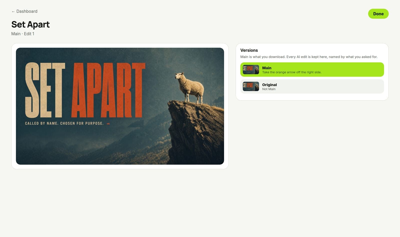
In Church Graphics, the project you picked is the source of truth. You already chose a style. You already approved a concept. The matching sizes came from that look.
When one detail is wrong:
- Open that project — not a new blank one.
- Use AI edit to change the image or the lettering with the plain sentence you wrote.
- Check the title still reads. Check the logo still sits where it belongs.
- Re-download the sizes you need from the same look.

You are not "prompting a new church." You are correcting a file. That is the whole point of revise-without-starting-over: the concept stays, the mistake leaves.
If the edit drifts the look too far, go back to the earlier version and try a tighter sentence. "Remove the orange arrow" beats "clean it up and make it more minimal."
When you should regenerate instead
Some notes are not one-thing edits. Regenerate when:
- The metaphor is wrong for the sermon ("this looks like a youth lock-in, not Romans").
- The type system is wrong (thin script on a twenty-foot screen).
- Leadership wants a different emotional tone (lament vs celebration).
- You picked the wrong reference photo on purpose and hate the room.
Those are art-direction changes. Pay for them once. Do not pretend they are arrow removals.
Everything else — date, stray icon, contrast on one word, logo size — is an edit. Treat it like one.
The test we use on every campaign
Before Church Graphics ships a feature email or a product still, we run a boring test: can someone change one real thing on the graphic without throwing the design away?
"Take the orange arrow off." If the tool forces a full redesign for that, the workflow is broken for a volunteer at 10pm too.
Your Saturday should pass the same test. One wrong detail. One sentence. Same look. New file.
What this is not
This is not "never regenerate." Sometimes the concept is wrong. Say so and pick again.
This is not infinite polish. One rewrite window for real ministry changes. Five rounds of "maybe try blue" is how you burn the volunteer.
This is not a promise that AI never mishears you. If the edit misses, tighten the sentence and run it again on the same project. Do not open a second app and rebuild from memory.
Do this on the next revision text
When the next "quick change" lands, reply with the one-sentence edit and do it in the existing project.
Download the updated sizes. Do not redesign the square from scratch because the stage file had a bad arrow.
Fix the one thing. Keep the look. Ship.