Kids and Youth Should Not Match the Adult Series
Same church. Different room. Different job. Logo and colors can travel. The adult series texture does not have to.
Your adult series looks sharp. Dark type. Quiet photo. Title that reads from the back row.
Then children's ministry asks for "the same look but for kids," and someone pastes the sermon title treatment onto a cartoon background. Or youth gets the exact adult slide with "WEDNESDAY" stamped in the corner. Parents squint. Students ignore it. The brand police feel consistent. The audience feels nothing.
Same church. Different room. Different job. The graphic should say so.
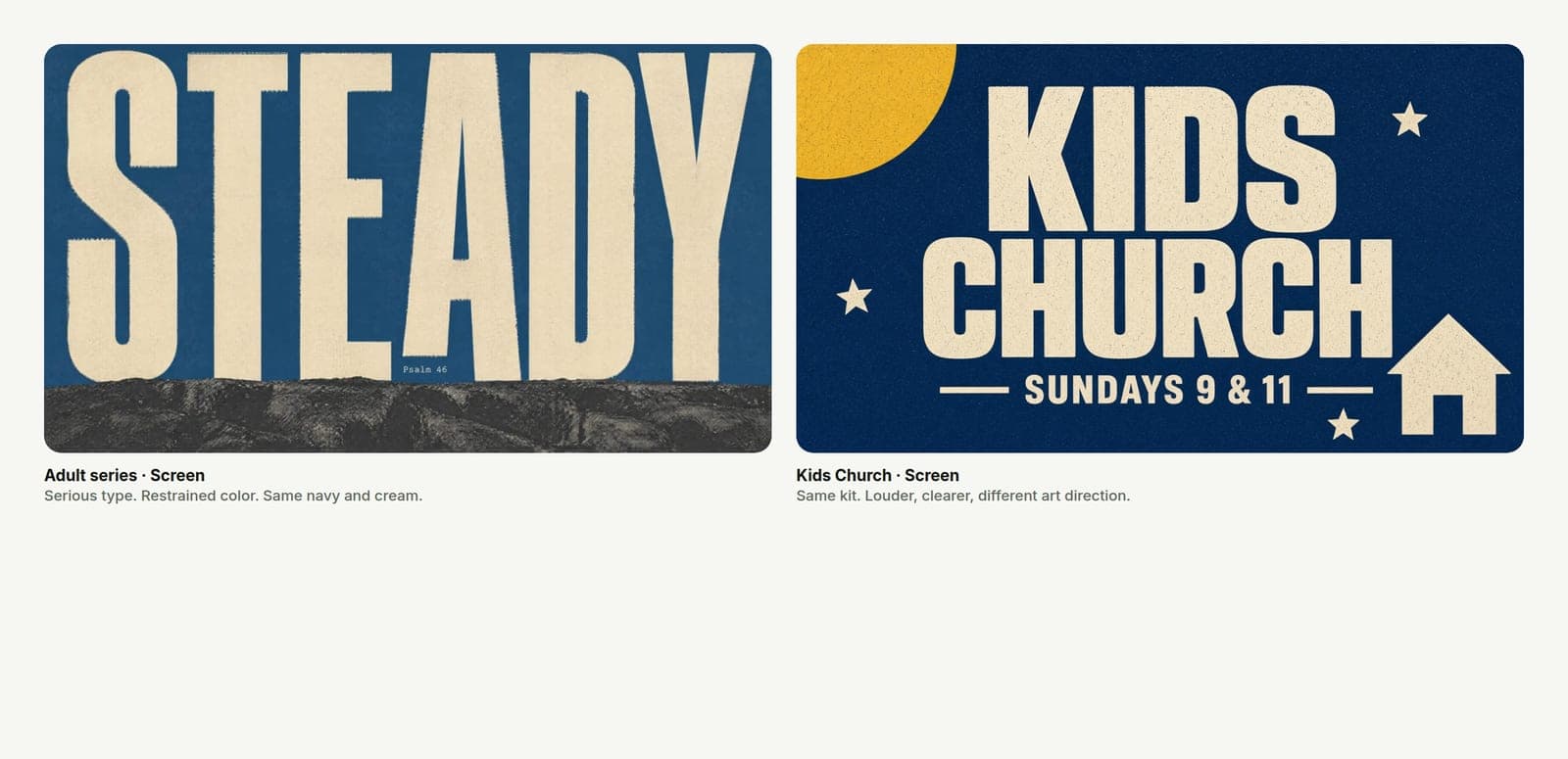
Consistency is not identical art
Brand consistency for a church is logo, colors, and trust — not one texture on every ministry.
Adults walking into the auditorium need clarity and weight. Kids walking into a hallway need energy they can read while holding a parent's hand. Students deciding whether Wednesday is worth leaving the couch need something that looks like it belongs on their phone, not like a leftover Sunday title slide.
If every graphic looks like the main series, the main series stops meaning anything. It becomes wallpaper.
Give each audience one clear job
Before you open a tool, finish this sentence for the piece:
- Adults / weekend: What is Sunday about, in the fewest words?
- Kids: What are we inviting a family to do — check in, show up, join a class?
- Youth: What is the night, and why would a student care this week?
One job. One title. One action. Kids and youth graphics die when they try to carry the adult sermon metaphor plus a schedule plus five ministry logos.
What should stay the same
Keep the things that prove it is your church:
- Logo (correct file, not a screenshot).
- Core colors (the real blue, not "close enough").
- Type that still reads — you can get louder without getting unserious.
- Quality bar — no clip-art that would embarrass you on the adult screen.
Save logo and colors once in Church Graphics so the volunteer is not hunting brand folders every Wednesday. Shared brand kit. Separate looks.
What should change on purpose
Change the art direction for the room:
| Adult series | Kids | Youth | |
|---|---|---|---|
| Type | Fewer words, heavier | Bigger, simpler words | Bold, phone-first |
| Color | Restrained | Higher contrast, clearer shapes | Stronger accent, less "corporate church" |
| Metaphor | Sermon-true, often quieter | Concrete and friendly | Social energy without chaos |
| Detail | Atmosphere can be subtle | Busy backgrounds lose the title | Faces and clutter lose the title on a Story |
You are not making three brands. You are making three readable invitations under one roof.
A clean way to brief it
Bad:
Use the Steady series look for kids church too so everything matches.
Good:
Kids Check-In — same logo and blue as weekend. Louder type, simpler scene, no adult series texture. Title: "Kids Church — Sundays 9 & 11." Sizes: hallway screen + Instagram square.
In Church Graphics, start a new project for the kids or youth piece. Lock brand colors and logo. Pick a different starting style than the adult series on purpose. Generate two options. Pick the one a nine-year-old or a fifteen-year-old would understand without a staff explanation.
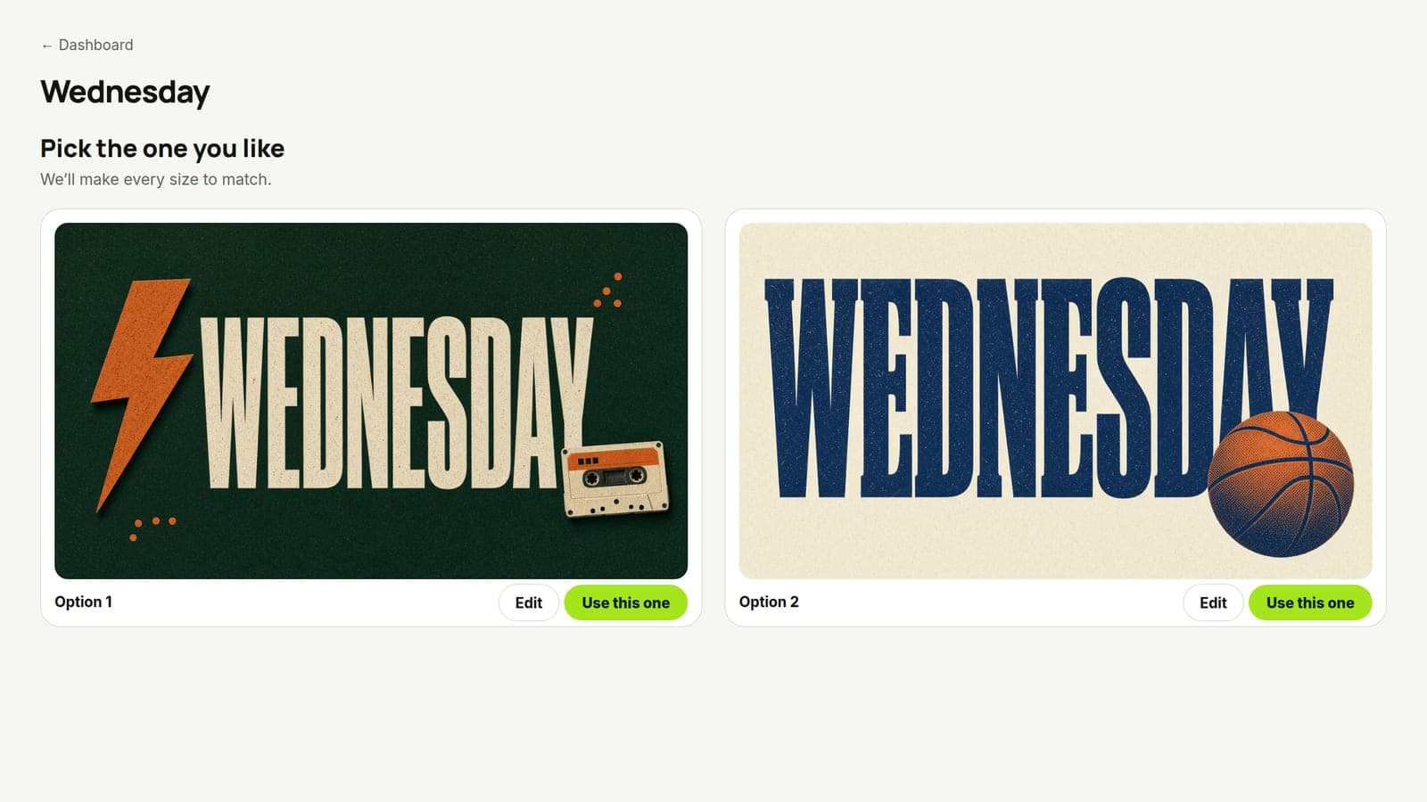
If the adult series must appear on a youth slide (shared conference, whole-church campaign), keep the series title treatment and rebuild the layout for phone and hallway — do not crop the auditorium slide and call it youth.
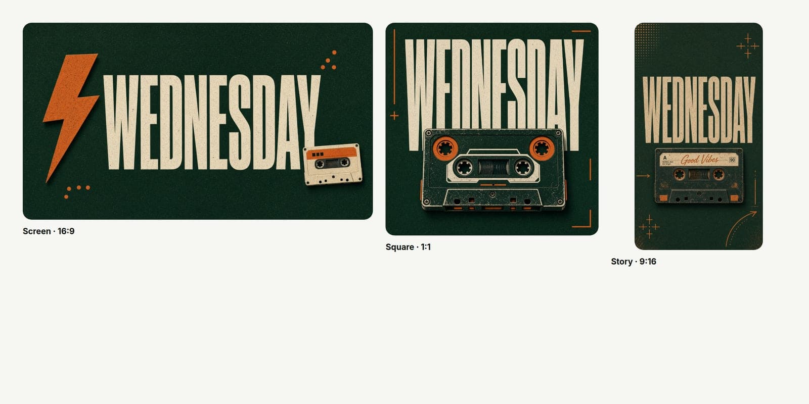
Rules that stop the "make it match" trap
- Same kit, different style. Logo and colors travel. Adult series texture does not have to.
- Read it on a phone in the hallway. If the kids title fails under fluorescent light, it fails.
- One ministry, one hero title. Do not stack adult series + kids brand + sponsor logos.
- Volunteer gets a brief, not a vibe. Title, ages, date, sizes, "louder than weekend / not the adult texture."
What this is not
This is not permission for chaos. Ugly is not "contextual." Kids and youth deserve the same craft standard as the auditorium — aimed at a different person.
This is not a lecture against shared campaign art. Easter, Christmas, and whole-church series should feel unified. Weekly kids and youth programming usually should not steal the adult sermon look by default.
This is not punching churches that reuse files when the team is thin. Reuse the brand kit. Change the look. That is the cheaper fix.
Do this this week
Pick one kids or youth graphic that is clearly a cropped adult slide. Rebuild it as its own project: same logo and colors, different style, title sized for the actual room or phone.
Ship that one. Notice whether parents or students actually understand it faster.
Same church. Different room. Different graphic.