Leave Room for the Lyrics
Series title art can be bold. A lyric background from the same look needs an empty center, so people can sing instead of decoding the slide.
Your sermon series art can be bold. Your lyric background cannot.
If the worship words have to fight the graphic, people stop singing and start decoding. Build a quiet slide from the same look — not a second unrelated aesthetic, and not the title slide with the type deleted in a hurry.
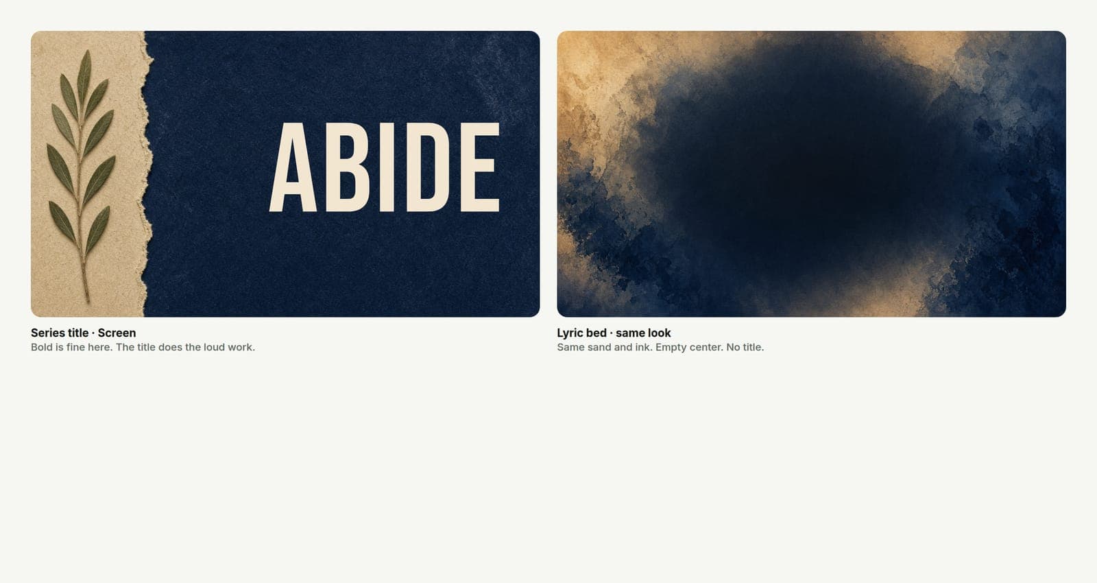
Two jobs. Two files.
Series title graphic — sells the idea. Big words. Strong metaphor. Fine if it is busy in a controlled way.
Lyric / worship background — carries someone else's words. Needs empty space, soft contrast under white or light type, and almost no competing detail in the center third.
Same series. Same colors and texture family. Different job.
Churches get in trouble when they drop the title art into ProPresenter and type lyrics on top. The title was never built as a bed.
What "same look" means for a background
Matching does not mean identical.
Keep:
- The color story (warm sand, cool blue, ink and paper — whatever you locked).
- A hint of the texture or light from the series.
- The overall mood.
Remove or push back:
- Large title type.
- Busy focal objects in the middle.
- High-contrast edges where lyrics will sit.
- Logos in the lower third where song words land.
Think "atmosphere from the series," not "poster with the words erased."
Build both when you build the series
When you start the project, do not only export the hero title.
Practical set for a normal Sunday:
- Title / key art (screen)
- Text-free or low-detail background (screen)
- Social sizes from the title look
- Thumbnail if you stream
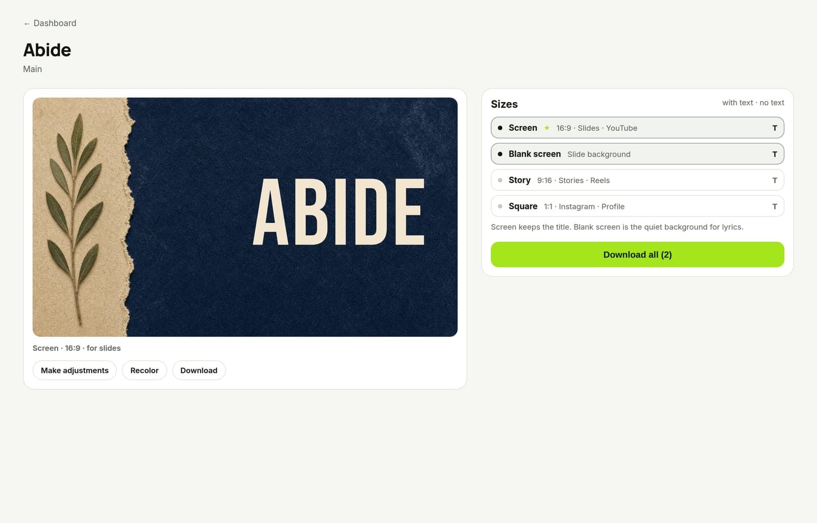
In Church Graphics, choose the screen size (and the other sizes you need) in one project. Approve the series look. Then make or export a quieter background pass that keeps the palette — use an edit aimed at "clear center for lyrics, same texture, no title" rather than a brand-new style.
If you use ProPresenter-ready exports from the same account, keep the lyric bed in that pack so Sunday ops is not hunting a random JPEG in a shared drive.
Test where it actually plays
Laptop previews lie.
- Put sample lyrics on the background in your presentation software.
- Check from the back third of the room if you can.
- Watch for stage wash: soft gray type on a soft photo dies under lights.
- Prefer light lyrics on a darker, simpler field when you are unsure.
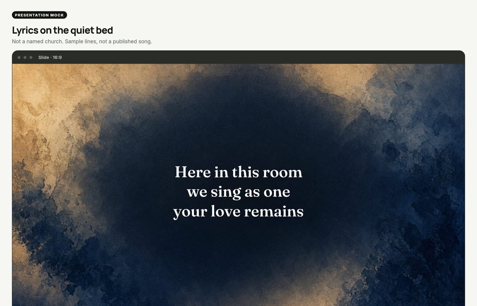
If the words disappear, the background is still too loud. Quiet it. Do not make the lyrics louder with a cheap stroke that fights the series type system.
Rules that keep worship readable
- Center stays calm. Put leftover drama in the edges or behind a soft wash.
- One texture, lower opacity. Grain and light are fine. Collage is not.
- No Scripture stamp under the chorus. The song has words. Do not add a second paragraph.
- Same series, whole season. Week three should not invent a new sky because someone got bored.
- Announcements are a third job. Do not reuse the lyric bed for dense announcement text without a layout pass.
What this is not
This is not "make worship slides boring." Calm is not empty of taste. It is empty of competition.
This is not a ProPresenter manual. Your team's templates and arrangements still matter.
This is not punching churches that use a solid color. A solid in the series palette with readable type beats a masterpiece nobody can sing over.
Do this on the next series
When you lock next series art, export two screen files on purpose: the title, and the lyric bed.
Open the bed in your presentation tool. Paste a real chorus. If you hesitate, quiet the file and re-export from the same project look.
Leave room for the lyrics. Let the series art do the loud work somewhere else.