Your “New Here” Graphic Should Answer Three Questions
A guest deciding whether to visit needs three answers: when you gather, what happens with kids, and the next step. A handshake photo is not enough.
Someone is deciding whether to visit this weekend. They are not looking for a stock photo of a handshake.
They are looking for three answers: When do we gather? What about my kids? What happens when I walk in?
If your "New Here" graphic cannot answer those, it is decoration. Fix the answers. Keep the look simple.
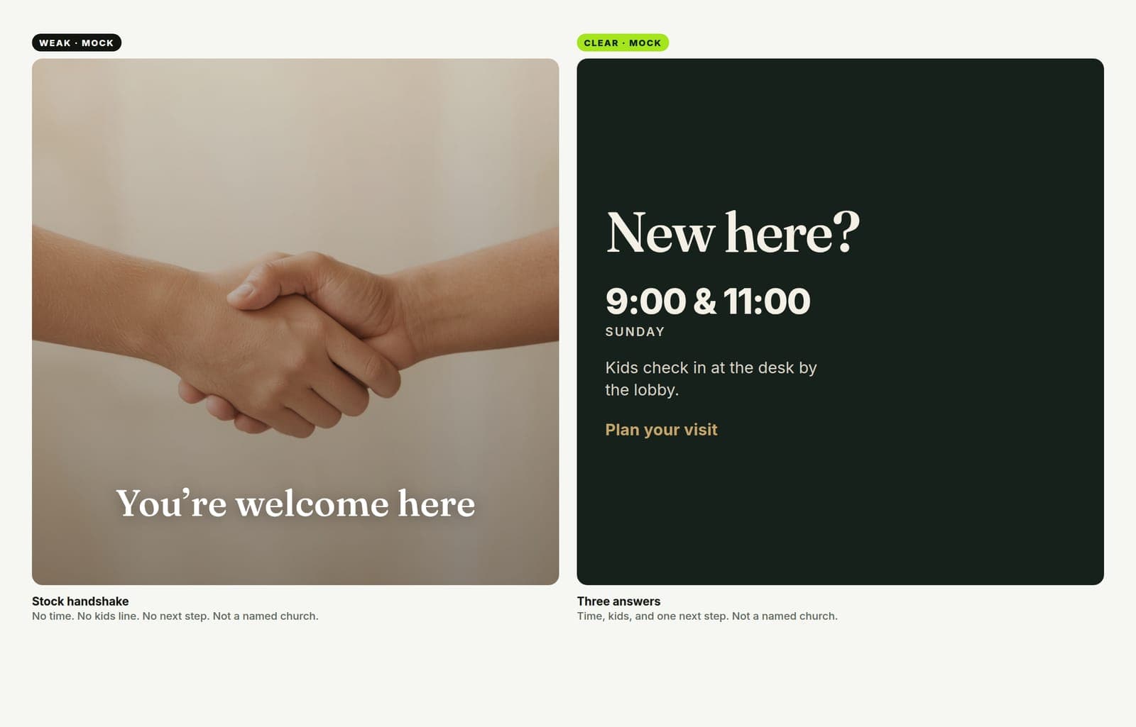
What guests actually need
First-time guests are not asking for your brand story on slide one. They are reducing risk.
On a phone, in about two seconds, the graphic should make plain:
- When — service times. Exact. Not "Sunday mornings."
- Kids — where they go, or that kids are welcome in the room. One line.
- Next step — Plan a visit link, a QR to the same page, or "Stop at the Welcome desk." One clear action.
Location helps if you have more than one campus or people often confuse the building. "What to wear" only if your culture is genuinely unclear — most churches overthink it.
If the post is beautiful and still missing times, it failed.
Stop the handshake template
The internet is full of the same welcome art: soft light, two hands, the words "You're welcome here," no clock, no kids line, no link.
That image does not reduce anxiety. It says your church has a Canva account.
You do not need colder design. You need clearer information hierarchy:
- Big: the invite ("New here?" / "Plan your visit")
- Next: times
- Then: kids + one next step
- Small: logo and campus name if needed
Atmosphere can sit behind that. It should not replace that.
Make one look. Ship every size.
You will use this more than once a year.
Useful set:
- Square for Instagram and Facebook.
- Story / vertical for Stories and sticky digital signage.
- Screen if you run a pre-service loop in the lobby or auditorium.
- Print if you still put a card or poster near the doors — same words, same look.
In Church Graphics, describe the invite in plain words (times, kids note, next step). Pick a style that matches your church, not a random "welcome" template. Choose the sizes in one project. Approve the concept. Download the matching files.
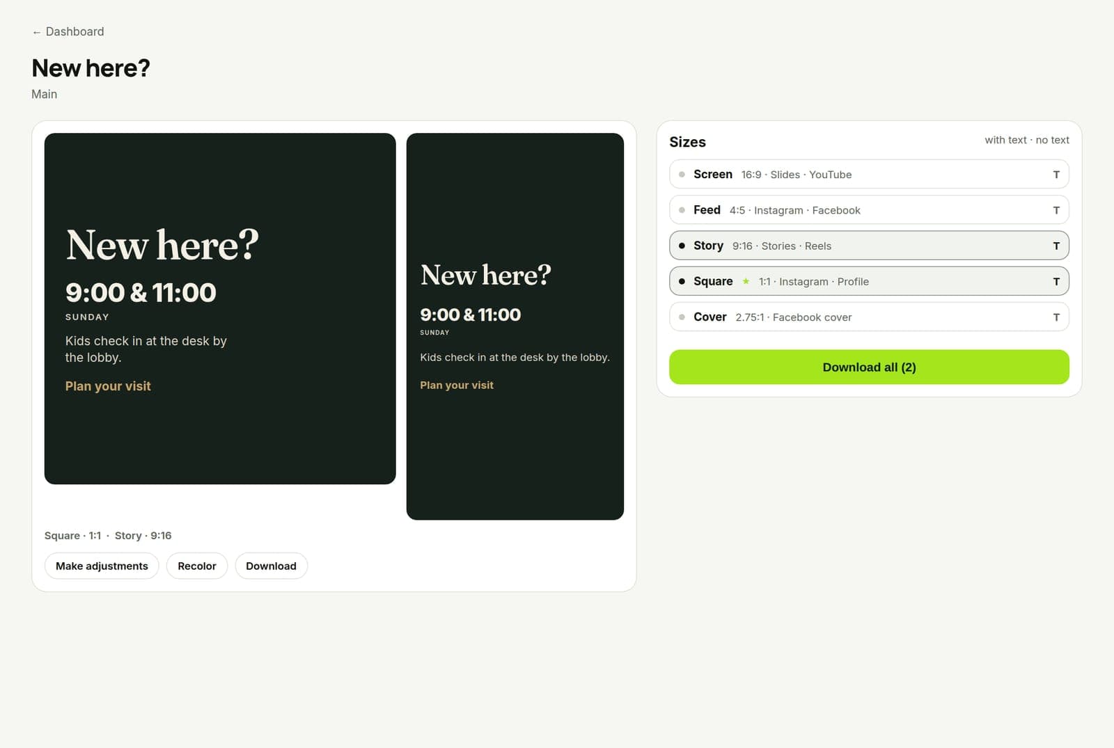
When times change for Christmas Eve or a special Sunday, open the same project idea, edit the one line, re-export. Do not redesign the handshake from scratch.
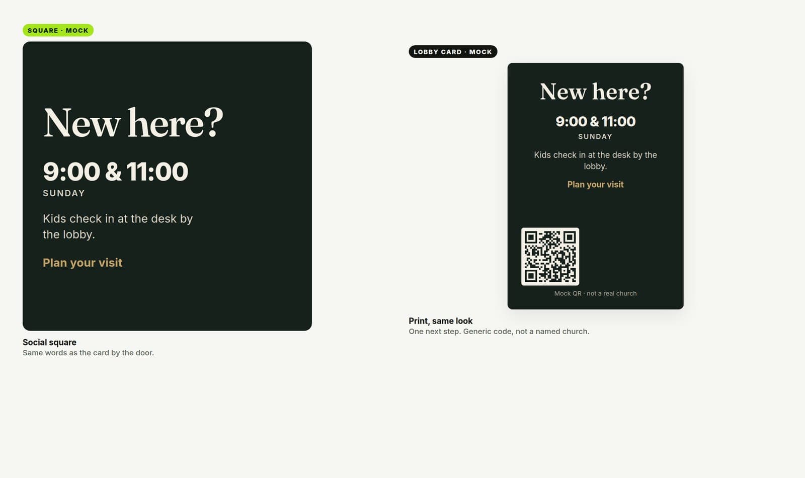
Rules that keep the invite honest
- Put the time on the graphic. Linking to a page is good. Hoping they open the caption is not enough.
- One next step. "Plan a visit," "Text HELLO," or "Meet us at the Welcome desk." Not all three.
- Kids line in human words. "Kids check in at the desk by the lobby" beats "Robust family ministry ecosystem."
- Same look as the rest of the church. A neon guest post next to a quiet sermon series teaches people your brand is random.
- Update it. Wrong times on a pinned post are worse than no post.
What this is not
This is not a full guest-services playbook. Parking teams, greeters, and follow-up still matter more than pixels.
This is not "never show people." A real photo of your room or your team can help — if the three answers stay readable.
This is not punching small churches with one service and a handwritten sign. If the handwritten sign has the time and the kids note, it is already beating most stock templates.
Do this this week
Open your current "New Here" or "Plan a Visit" post on your phone. Cover the caption. Can you still see times, kids, and a next step?
If no, make a new project in Church Graphics with those three lines in the brief. Export square and story at minimum. Replace the pinned post and the lobby screen before Sunday.
The welcome starts before the lobby. Make the graphic do its job.